HomeWriting
The graph shows the rates of participation in three different activities in a UK sports club between 1995 and 2015
2024-07-23
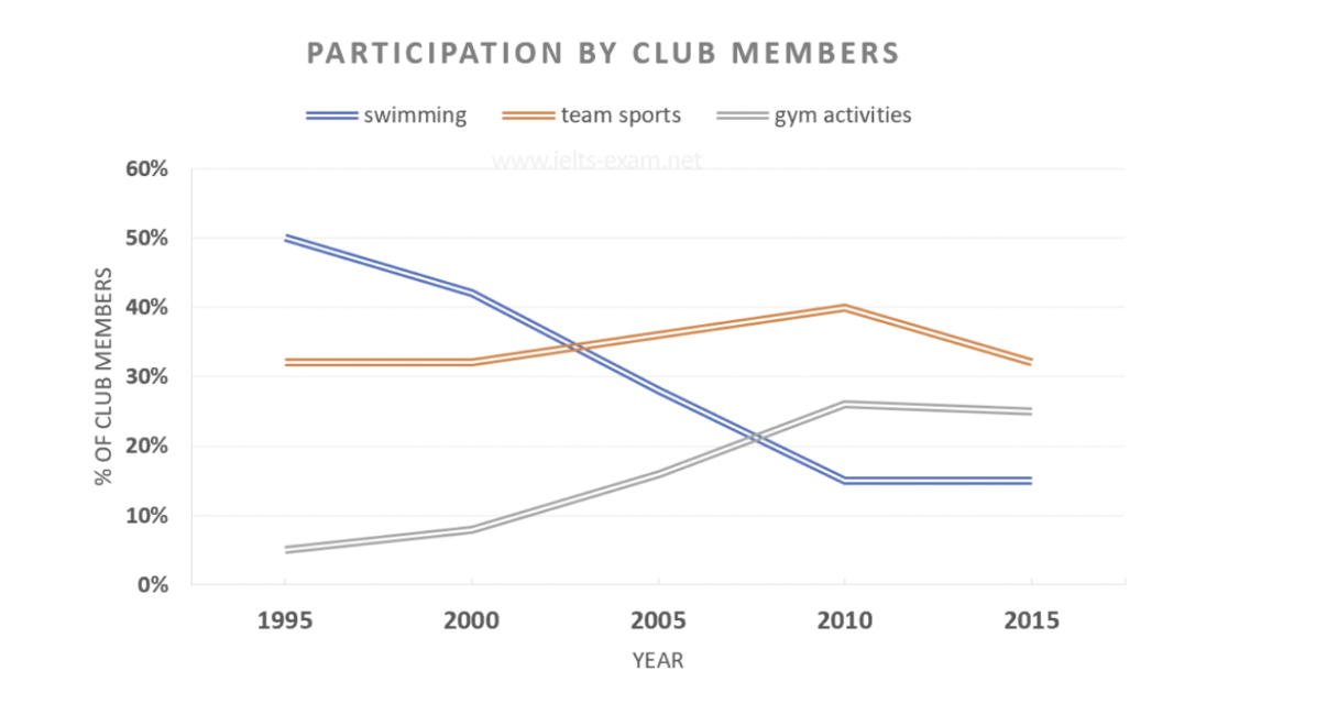
The line graph illustrates the participation rates of members in a specific UK sports club in swimming, team sports, and gym activities from 1995 to 2015.
Overall, there was a significant rise in the popularity of gym activities throughout the period, while the engagement in swimming saw a noticeable decline. The category of team sports experienced comparatively minimal changes but concluded with the highest percentage.
Beginning with swimming and gym activities, initially, half of the club members were involved in the former. However, from 1995 onward, participation in swimming gradually decreased to a low of about 15% in 2010, remaining at this level for the remainder of the period. In contrast, gym activities exhibited a substantial increase in participation, with figures rising from a mere 5% to around 28% between 1995 and 2010. Towards the conclusion of the period, the percentage of participants in gym activities declined, but this decrease was relatively consistent.
Shifting focus to team sports, after remaining at approximately 30% for the first five years, participation increased significantly, reaching its peak at 40% in 2010. However, this peak was not sustained, as it was followed by a steep decline in the final year depicted.