HomeWriting
The charts below show the percentage of male and female workers in country A and country B
2024-07-29
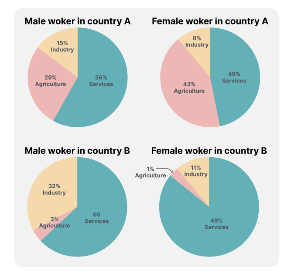
The provided pie charts depict the distribution of male and female workers across four distinct sectors in two nations.
Overall, the data highlights a notable preference for employment in the service industry by both genders, while it is evident that residents of Nation A engage more in industrial work, and those of Nation B are more involved in agriculture.
Analyzing the specifics, in Nation A, the service sector takes the lead with 56% of male and 49% of female workers, mirroring the situation in Nation B. In contrast, agriculture sees a higher male workforce in A at 29%, tripling the corresponding figure in B. Interestingly, more females in A are engaged in agriculture, accounting for 43%. The industry sector records the lowest participation, with only 15% of male and 8% of female workers.
Turning to Nation B, the service industry continues to dominate, constituting 65% of male and 49% of female workers. In the industrial sector, 32% of men are employed, twice the proportion in Nation A. However, women in Nation B show less inclination towards industry, with a mere 11% participation rate, contrasting sharply with the higher figures for both genders in agriculture, standing at three-fold and ten-fold greater respectively.