HomeWriting
Summarise the information by selecting and reporting the main features, and make comparisions where relevant
2024-09-19
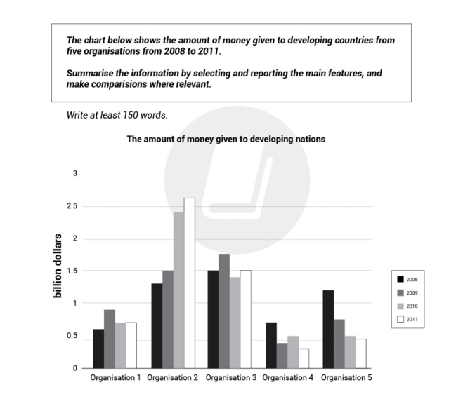
The given bar chart illustrates the quantity of money provided by five different organisations to developing countries between 2008 and 2011.
Overall, it is evident that there were upward trends in the financial allocations of organisations 1 and 2, as opposed to that of organisations 4 and 5. Meanwhile, the data for organisation 3 remained unchanged. Additionally, it is also noteworthy that organisation 2 witnessed the highest figures for most of the period, which peaked in 2011.
As depicted from the chart, the amount of money provided by Organization 1 organization's amount of money 1 increased significantly from 0.6 billion dollars to 0.9 billion dollars between 2008 and 2009, and then decreased slightly to 0.7 billion dollars in 2010, before it remained static throughout the period in 2011. Moreover, the figure for organisation 2 underwent a minor uptick, inching from 1.3 billion dollars to 1.5 billion dollars from 2008 to 2009, and subsequently saw a substantial rise, surging to 2.7 billion dollars in 2011.
Shifting the focus to the remaining organizations, the allocation of Organization organization's number of money 3 varied between 1.4 billion dollars and 1.8 billion dollars during the transition from 2008 to 2011. In addition, the expenditure of organisation 4 saw a marked reduction from 0.8 billion dollars to 0.4 billion dollars from 2008 to 2009, which then moved back and forth from 0.3 billion dollars to 0.6 billion dollars between 2010 and 2011. Finally, after there was a substantial decline in the funding from organisation 5, going from 1.2 billion dollars in 2008 to 0.8 billion dollars in 2009, it exhibited a slow decline, transitioning to 0.5 billion dollars in 2011.